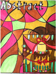
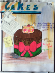
Aboriginal Cake
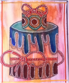
To create this picture, I used a tracing paper to copy the same cake onto another page. I then painted in the bow, dripping chocolate, roses and jellybeans, but before doing all this, I painted the background with a fan brush.
Then after painting the main aspects of the cake, I used several colored pens to create the aboriginal look. Using the white-out, I outlined everything to make it stand out from the page. The colors I used were red, black, green and gold.
I finished the page of by sticking ready cut paper ribbon strips around page, creating a border. I used the same colors for the strips like the color of the background.
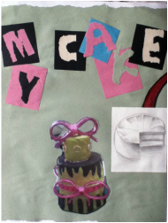
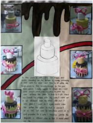
Final Composition Idea
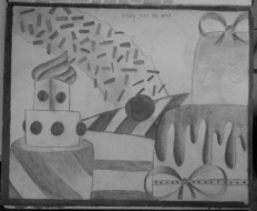
After everyone in our class had finished building their cakes, our class had set up and area where all the cakes were showcased. I picked these four cakes to put in my final composition idea.
In my actual painting though, instead of the doughnut in the background, I put a cupcake in between the 3 tiered cake and the slice of cake.
In this sketch, the media used is a 6B pencil, in my painting, I used acrylic paints.
In my actual painting though, instead of the doughnut in the background, I put a cupcake in between the 3 tiered cake and the slice of cake.
In this sketch, the media used is a 6B pencil, in my painting, I used acrylic paints.
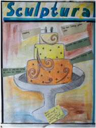
Painting of my Cake
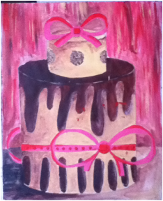
This dramatic painting of my cake was done with acrylic colors to give a shine to it. I first drew the top tier and bottom tier using the right measurements and proportions. Then I started painting.
I made sure to use at least some of the same colors of my real cake. I used the lighter colors in some of the darker areas to create the tone and from, to make it look like it's 3D. The background was done using the remainder paints, in a vertical brush stroke.
The base was done as if the light was coming from the right to left as all the other light to dark areas.
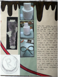
Ribbons
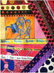
Because I used 3 bows on my cake, I thought it would've been a good idea to create some links to different types of ribbons, different styles and designs.
I used some real ribbons, stuck it to the page and copied it. I first copied the ribbon with the same color, then copied it again, but this time, using the color scheme of my cake.
I used some real ribbons, stuck it to the page and copied it. I first copied the ribbon with the same color, then copied it again, but this time, using the color scheme of my cake.
In some places that had too much white space, I drew bows overlapping each other. They were painted using the color scheme of my cake.
I tried to link all the colors of the ribbons to the same colors of my cake.
I tried to link all the colors of the ribbons to the same colors of my cake.
Artist Reference-Paul Klee
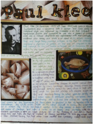
To match my page on abstract, I did two pages on an artist called Paul Klee. He is an abstract artist. He was born on 18th December 1879 and died on 29th June 1940.
His highly individual style was influenced by movements in art that included expressionism, cubism, orientalism and surrealism.
His work reflects his seriousness, his personal moods and beliefs, his musicality and sometimes his childlike thinking.
His highly individual style was influenced by movements in art that included expressionism, cubism, orientalism and surrealism.
His work reflects his seriousness, his personal moods and beliefs, his musicality and sometimes his childlike thinking.
"First of all, the art of living; then as my ideal profession, poetry and philosophy, and as my real profession, plastic arts; in the last resort, for lack of income, illustrations."-Paul Klee
In his early years, his parents wanted him to be a musician, but he decided to do visual arts during his teen years. He stated, "I didn’t find the idea of going in for music creatively particularly attractive in view of the decline in the history of musical achievement." He had a mind of his own.
To honor him, I tried to copy one of his pieces of work, which was "Death and Fire" 1940. He used oil on paper but since I didn't have any ink, I used oil pastels on black paper. I tried to get the same texture as his version of the painting.
Abstract Write-up
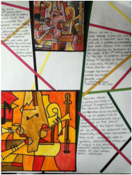
Because of my abstract cake, I decided to do a write-up about abstract and another painting. To make the page more abstract, I divided the page into many parts using ready cut-out thin pieces of paper, kind of like a paper ribbon. Then was the writing, Just 3 paragraphs on abstract art.
This time the painting was on musical instruments. I used the same method, which was drawing it in plain pencil, the color scheme was a little different than the actual picture, but it was around the same colors.
This time the painting was on musical instruments. I used the same method, which was drawing it in plain pencil, the color scheme was a little different than the actual picture, but it was around the same colors.
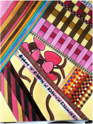
Abstract Art
I thought about making a painting of my drawing, but ABSTRACT, I drew it in pencil to see what it would look like, it looked unique. There were so many joints or ideas that made making my cake abstract, easy.
So for the background, I drew random curves on the paper. I painted it in using different colors, making sure not to get the same color next to each other. In the main drawing, I first drew the cake, then tried to make it abstract by extending the dripping chocolate outside of the cake, extending the bow to almost leave the page. I added jellybeans hanging from the top of the painting and sticking out from the bottom.
In the end, I kept to my color scheme with the painting, and it matched the background perfectly.
Cake Write-up
After building our cakes, we had to write about the construction and the development.
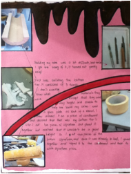
Building my cake was a bit difficult, but once I got the hang of it, it turned out pretty easy! First was building the bottom tier. It consisted of 2 types of foam and another soft material. I used a glass plate as a stencil, I drew around it on a piece of cardboard and decided that it was my bottom tier's width.
I cut 2 pieces of stryafoam and glued it together but noticed that it wouldn't be a good height so I cut out 2 pieces of brown stryafoam and since it was already in half, I glued it together and taped it to the cardboard.
I cut 2 pieces of stryafoam and glued it together but noticed that it wouldn't be a good height so I cut out 2 pieces of brown stryafoam and since it was already in half, I glued it together and taped it to the cardboard.
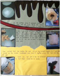
I cut out another piece of cardboard, using the plate as the stencil, and put it on top of the brown styrafoam so that it would be even, because I did't cut it to the same size. Then to do the top tier, I cut up a piece of a soft fabric-like material and taped it together. I also cut out a piece of cardboard to the right size and put it on top the of the tier so it would've been even.
I then noticed that the bottom tier was still not tall enough. So I cut another 2 pieces of the brown styrafoam and stuck it together using the tape and the glue gun. I taped the last part to the tier all around so that there would be no holes.
I then noticed that the bottom tier was still not tall enough. So I cut another 2 pieces of the brown styrafoam and stuck it together using the tape and the glue gun. I taped the last part to the tier all around so that there would be no holes.
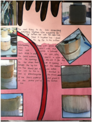
The next thing to do was assembling everything together. After everything for the bottom tier was the same size. I glued it all together. Then I glued the top tier to the bottom.
Unfortunately, there were areas where it wasn't even and there were spaces between each third. So using the fabric material, I used it to cover and close the openings. I also used this method for the top tier where there was and opening in between the top tier and the bottom.
The second part of the bottom tier was too thin so I decided to peel off rectangular pieces of the fabric material and glued it on the second part of the bottom tier.
Finally after building the cake, it was time to mud-roc it. All I had to do was cover the entire cake in mud-rock. I also had to build my bows and jellybeans.
To make the bows, I used newspaper wrapped in wire and bent it to make the loops. Then I wrapped another piece of newspaper with the wire to make the extra bits hanging out. I then cut a ball of cushion and wrapped it in wire and stuck it to the cake.
To make the jellybeans, I cut out long ovals out of a cushion and wrapped it in wire. Then I stuck it to the cake. Finally when all the designs were finished, I had to mud-rock it. Then when all the mud-roc was dry, I had to prime the cake so that the paint would stick.
Evaluation
In this piece of work, I find the shapes and forms standing out, the texture is bumpy portraying a real cake. The color and tone is within one color range except for the pink color, which I really wanted to stand out. I have used acrylic paints, over any other, to paint my cake because it is thick. Overall, I am pleased with my cake, it came out a bit different than my initial idea, but it looks good. If I could do it again, I would make the bottom tier wider so that it wouldn't be so tall but wide as well, which would be a good proportion for a cake. I would have painted the jellybeans a different color as well.
Cake Design-Idea 1
Before actually creating the cake, we had to have a few ideas and plans.
For my first idea, I wanted to make a wedding cake. It was going to have 3-tiers. I was thinking of making the colors just off-white, but in my book, I colored it in. I wanted swirls on the cake, as an add-on, so that it would have the 3D effect. They were going to be gold in color. It was also going to have 2 figures on top of the cake being a man and woman. To fill up the spaces, I wanted to have tiny stars all over the cake.
For my first idea, I wanted to make a wedding cake. It was going to have 3-tiers. I was thinking of making the colors just off-white, but in my book, I colored it in. I wanted swirls on the cake, as an add-on, so that it would have the 3D effect. They were going to be gold in color. It was also going to have 2 figures on top of the cake being a man and woman. To fill up the spaces, I wanted to have tiny stars all over the cake.
Idea 2
For my second idea, it was a 2-tier cake. It had a big wide base and a small top tier. I used this idea for my actual cake but changed it a bit.
In this idea, there was going to be dripping chocolate, a very pink bow and bright green jellybeans. On the top tier, I was going to have roses going around on the side and 1 on the top. Around the roses on the top tier, I wanted to have the effect of real icing on the cake.
My actual cake, had a really tall base tier. The only change on the bottom tier was that the jellybeans were further apart and were chocolate brown color. For the top tier, It was taller, unfortunately it didn't have the icing effect but it had the roses. Instead of a rose on top of the cake, I had a bright pink bow with 3 sparkly ribbons, going down the center of the rose and on each side of it.
Leonardo Da Vinci Exhibition-Robot
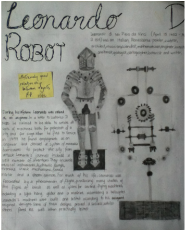
During our school year, we were lucky enough to experience the Da Vinci Exhibition. It consisted of Leonardo Da Vinci's inventions. We had to go around and see 2 inventions that we liked, or were fascinated by, and draw it.
It showed how his mind functioned to create these mechanism's. like the robot, the outside looked like an armor suit, but the inside was totally robotic. While looking at the inventions, there were some write-ups of what the invention is or what it meant to him.
It showed how his mind functioned to create these mechanism's. like the robot, the outside looked like an armor suit, but the inside was totally robotic. While looking at the inventions, there were some write-ups of what the invention is or what it meant to him.
Mirror Chamber
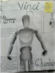
The second picture I chose was the Mirror Chamber, which consisted of a wooden figure in the center of a mirror chamber shaped as a hexagon. The figure's joints could be moved to different positions, I set up the position that I wanted it to be and began drawing.
After a while of drawing and shading, this is my final piece of the mirror chamber, I tried to get all the tones of the figure, to get some form in the drawing. I also made sure that I got all the right proportions.
After a while of drawing and shading, this is my final piece of the mirror chamber, I tried to get all the tones of the figure, to get some form in the drawing. I also made sure that I got all the right proportions.
My Building Write-up
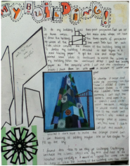
As part of our first semester works, we had to create a building, using the 3-point perspective technique. To draw up my building, I first set up the an A3 sized paper where I would draw the actual building. Then, I put papers on either side of the A3 paper, so that those would have the 2 point perspective. Then I put another paper on top of the A3 paper, so that it would have the 3rd perspective point.
After drawing and painting the whole building I had to create layers to make it stand out. I used a tracing paper to go over some of the parts that I wanted to put the layers on, then I traced the pieces on some cardboard and cut the pieces out. Then using the superglue, I stuck the pieces on the certain areas of level.
To make the building more "Dubai", I added a crane made out of wooden sticks. Then I added some Islamic designs on the building.
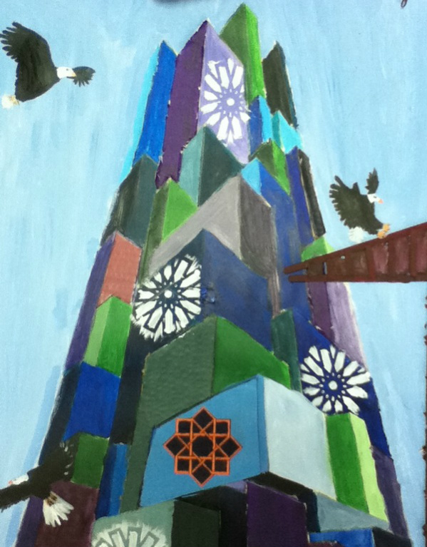
My final piece, after I added some eagles.
3-Point Perspective
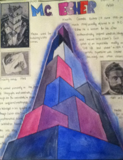
Three-point perspective is usually used for buildings seen from above (or below). In addition to the vanishing points from one before, one of each wall, there is now one for how those walls move into the ground.This third vanishing point will be below the ground. Looking up at a tall building is another common example of the third vanishing point, this time the third vanishing point is high in space.
An artist who uses this technique is Mauritis Connelis Esher who is usually referred to as M.C. Esher. He is known for his often mathematically inspired woodcuts, lithographs and mezzo tints. Although Esher didn't have and mathematical training, his contribution towards maths was very visual and intuitive.
An artist who uses this technique is Mauritis Connelis Esher who is usually referred to as M.C. Esher. He is known for his often mathematically inspired woodcuts, lithographs and mezzo tints. Although Esher didn't have and mathematical training, his contribution towards maths was very visual and intuitive.
2-Point Perspective
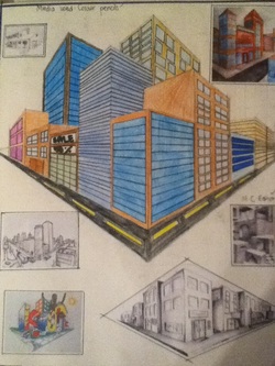
Two-point perspective can be used to draw the same objects as one-point perspective, rotated: for example looking at the corner of a house or looking at two roads shrink into the distance. One point represents one set of parallel lines, the other represents the other.
Looking at a house from the corner, one wall would move away towards one vanishing point, the other wall would move towards the opposite vanishing point.
Looking at a house from the corner, one wall would move away towards one vanishing point, the other wall would move towards the opposite vanishing point.
1-Point Perspective
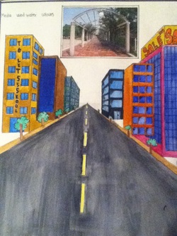
Perspective is a way to create illusions of three-dimensions (ie. height, weight, depth) on a two-dimensional surface (height and weight)
One vanishing point is typically used for roads, railway tracks, hallways or buildings viewed so that the front is facing the viewer. Any objects that are made up of lines, can be represented with one-point perspective.
One vanishing point is typically used for roads, railway tracks, hallways or buildings viewed so that the front is facing the viewer. Any objects that are made up of lines, can be represented with one-point perspective.
Elements of Art
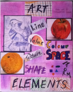
To study art, we had to start from the beginning, the basics which was learning the elements of art: Line, Value, Texture, Color, Space, Shape and Form.
This page was done to show the basic examples of the art elements. The background was done using soft pastels.
This page was done to show the basic examples of the art elements. The background was done using soft pastels.
Form and Space
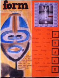
Form: Is an element of art that is three-dimensional and encloses volume. Cubes, spheres and cylinders are examples of various forms.
Space: Refers to the distance or area, between, above within or around things. It can be a description for both 2 dimensional and 3 dimensional portrayals.
Space: Refers to the distance or area, between, above within or around things. It can be a description for both 2 dimensional and 3 dimensional portrayals.
Color
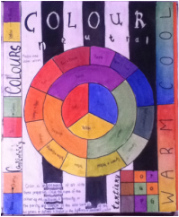
Color: Is an element of art with three properties;
Media used: Water Colors
- Hue: The name of the color e.g. red, yellow, blue
- Intensity or the purity and strength of the color such as brightness or dullness
- Value of the lightness or darkness of the color
Media used: Water Colors
Value
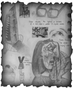
Value: Describes the lightness or darkness of a color. Value is needed to express volume.
Media Used: Shading Pencils (2B, 3B, 6B)
Media Used: Shading Pencils (2B, 3B, 6B)
Texture
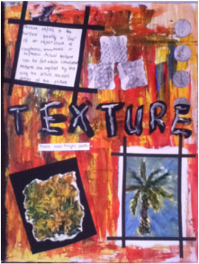
Texture: Refers to the surface quality or "feel" of an object, such as roughness, smoothness or softness. Actual texture can be felt while simulated textures are implied by the way the artists renders areas of the picture.
Media Used: Acrylic Paints and Shading Pencils (4B)
Media Used: Acrylic Paints and Shading Pencils (4B)
